We’ve been tracking the elections with our own business incident detection solution for the past several weeks, and it’s been so interesting to see the day to day elements of the campaigns such as debates or key news stories affect certain metrics.
As I explained in this previous post, we have been using the word “donate” together with the candidates’ last name to measure support of the candidates, analyzing time series metrics from Google Trends. Besides “donate,” we’ve followed key terms such as “women,” “taxes, and “Russia.”
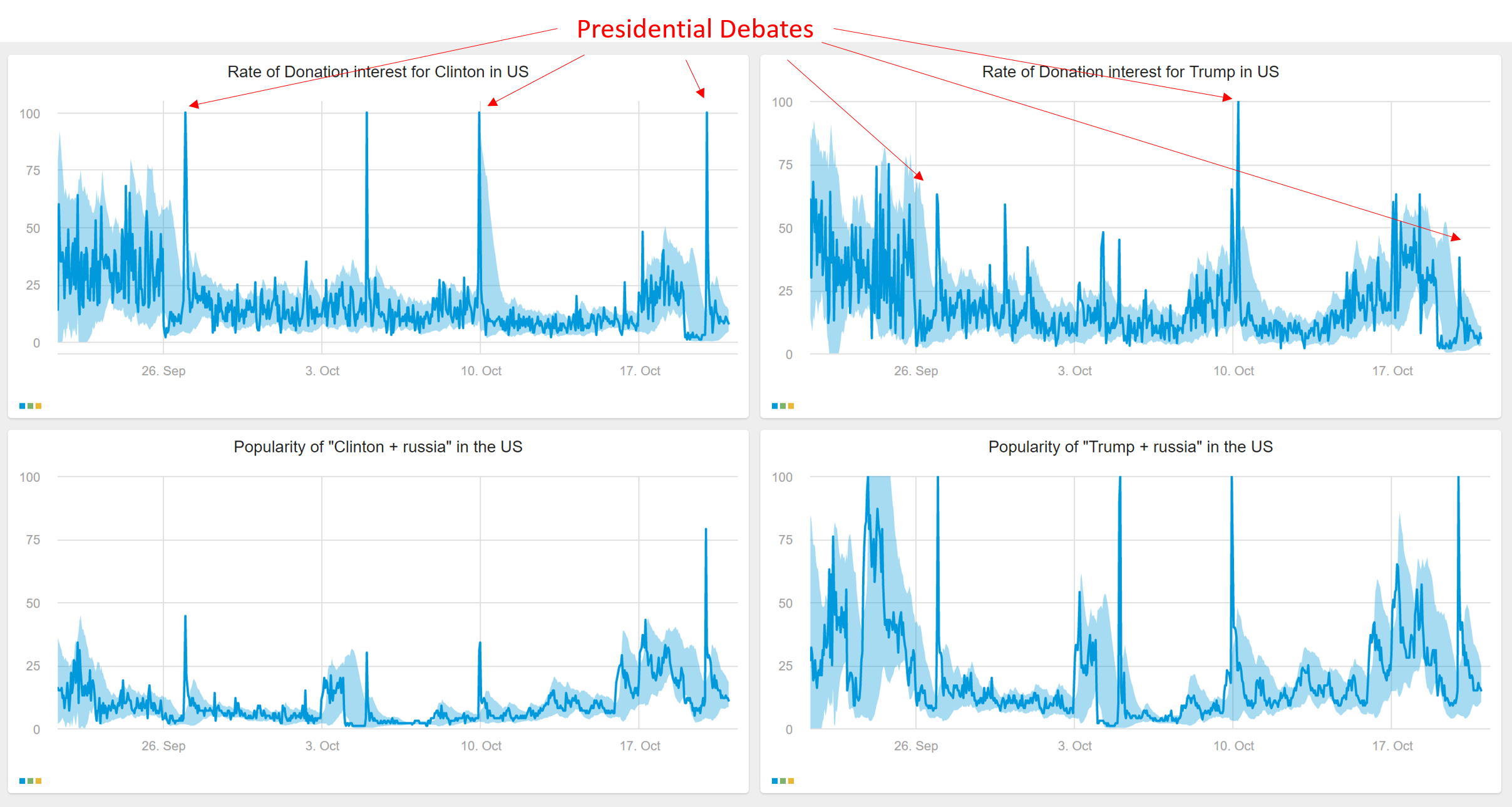
If we look at the three presidential debates together, it is easy to see that there was an increase in donation searches for both candidates immediately following the debates.
Interestingly, however, Trump’s donation interest was significantly lower overall than Clinton’s, and reached its biggest peak after the second debate. The bump after the third debate was fairly small for Trump, whereas Clinton’s hit the 100 mark.
What did jump sky high, however, for Trump, was the word “Russia”, much more so than Clinton who also saw an increase. Makes sense after Russia featured so prominently in the third debate.
I daresay the data may indicate that support is waning for Trump – either that or his supporters are running out of money.

Tying it back to the business world…these graphs demonstrate why it’s so important to correlate events with data metrics, since an anomaly (e.g. the jump in online searches for the candidate’s name & the word donation) is often correlated to an event. In this case the events were the debates, however other types of events more related to our customers’ world include holidays, extreme weather, marketing campaigns, and more.


